About the test
During weeks 8 and 9 of my Outreachy internship, I conducted a 12 persons usability test for GNOME version 3.16, using Fedora as operating system. It took me a little while to extract the information from the tests, but here I am with the first part of the results. 🙂
After the introduction I presented to each participant, they became curious and impatient to start the test. This was a good sign every time, as testers understood that we were testing the programs and not them.
Participants were free to choose the language version of GNOME (english or french). Five of them chose to test GNOME in french, while other tested the english version.
Initially, the scenario tasks I prepared took me about 30 minutes to accomplish. But in reality, the total test duration varied a lot, between 30 minutes and 1 hour and 30 minutes. One of the “rules” we established during the introduction part was to make a “comment break” after accomplishing the tasks designed for each program, so participants could express their opinions regarding the tasks and the problems they encountered.
Almost half of the participants on this usability test had never used GNOME before, but it was very interesting to observe them during the test, as I distinguished a common « behaviour pattern » . For example, when they discovered the hamburger menu in Nautilus, they understood that they could select many options from there. Or when they wanted to launch the slideshow animation in Image Viewer, their instinct was to go directly to this menu.
In general, the experienced users did not take a lot of time (1 to 5 minutes) to accomplish most of the tasks as they already knew how to explore the programs. But they also encountered some difficulties when trying to solve certain tasks (see more details in the sections below).
What went well:
In this usability test, the difficulty of the tasks varied a lot. Here are the tasks participants easily solved during the test:
Nautilus:
- Searching for a file:
Testers used different methods when they had to search for a specific file. Even if they just tapped the name of the file, clicked on the magnifying glass and then introduced the name of the file, used the CTRL + F shortcut or just explored the files, they all managed to find it quickly.
- Searching for a recently modified file
Evince
- Open a .pdf document
- Search for a title in the document
- Display two pages at once
Characters
- Search for a symbol from a specific font
Calendar
- Add a new meeting :
This Calendar task was definitely easy for the participants, as the program responded the way they expected. So they could easily create a new meeting with desired parameters (in this case a specific hour).
Image Viewer:
- Zoom in and out on an image
- Launch the slideshow animation:
Regarding the slideshow animation of the Image Viewer, participants encountered no difficulties, but most of the experienced users made an interested point by asking why there was a checkbox for the slideshow animation if it cannot be seen checked when the slideshow is launched: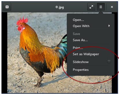
Where participants struggled
This section shows where participants were having a hard time when trying to accomplish some of the scenario tasks. (See all scenario tasks here).
Nautilus:
- Displaying files as list (task 2)
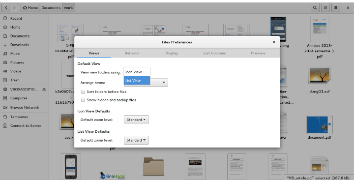
When told to display files as list, most of the participants tried the right click, then the hamburger menu from top-right corner of the window. Some of the testers discovered the Preferences option from the application menu, where they could modify the “Default View” parameters, by choosing “List View” from a dropdown list, as shown in the image bellow. Every participant who chose this method for displaying files as list complained that there was no “OK” or “Apply” button and they waited for an immediate feedback (which did not happen in this case). This made them feel confused and made comments like:
“Why nothing is happening?” or “This is not working”.
- Make the icons bigger (task 3)
In order to make the icons bigger, testers either used the option from preferences (but there was no visible effect), or tried to use the slider from the top-right menu. For those who chose this method, many started to drag-and-drop the slider, but were disconcerted by the lack of “visual feedback” as they moved the cursor to the left or right (see image bellow). Moreover, the absence of symbols like + or – (that would have explained the utility of the slider) made some of them give up.![]()
- Saving the location of a folder (task 5)
Another task participants struggled with was the task 5 from Nautilus, which goal was to save the location of a specific folder. Few participants tried to drag it into the upper part of the left sidebar, but only managed to move the folder into another one (Home, Documents, Downloads,…). Some of them even accidentally dragged it into the bookmarks section, but did not notice what happened.
Also, some of the testers used the hamburger menu to add a bookmark, but they were not sure what happened. While their attention was in the top-right corner of the window, they did not observe what happened on the left sidebar.
Other users wanted to create a shortcut of the folder on their desktop, so their first instinct was to use the right click, as they were familiar with using shortcuts in Windows, or because this seemed logical to them.
Only 3 participants managed to correctly accomplish this task (by drag-and-drop), and only one of them was already familiar with this Nautilus feature.
- Another difficulties users encountered in Nautilus
An interesting thing I observed in all the users’ behaviour in Nautilus was the fact that when they did not find something in the menu buttons, their first instinct was to right click in the program, and they seemed disappointed that they did not find the solution there.
People who had never used GNOME before had, most of the time, their attention on the top-left corner of the window and it took them a while to discover the hamburger menu from the top-right corner. They also got confused by the “magnifying glass” button in Nautilus and did not thought of using it when they were searching for a file, but discovered its functionality later. For most of them, the “magnifying glass” symbol represented the zoom functionality. More, when they were told to make the icons bigger, these testers got a little confused about the option “order by size”, from the menu button .
Evince
- Adding a note in Evince (task 4)
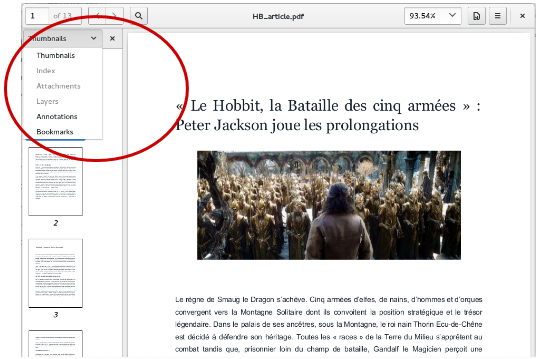
Another problem testers encountered was adding an annotation in a .pdf document. Only one participant accomplished this task, as he uses this feature at his work. After exploring the top-right corner menus, all testers hoped (again) to find a solution by trying to right click on the document. Participants seemed really lost when trying to solve this task. At a given moment, some of the testers tried almost everything, and they eventually found the “Annotation” option in the dropdown menu from the sidebar panel:
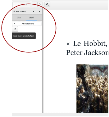
We can see that the only way to get to Annotations is by displaying the sidebar panel on the left side of the window, and then selecting the right option from the dropdown menu. But sometimes participants closed the sidebar panel by mistake and did not know how to get to it again. It was the moment when most of them gave up this task. Even when they discovered this option, some of the participants could not understand how it worked, as there was no indication on how to use it:
- Add a bookmark (task 3)
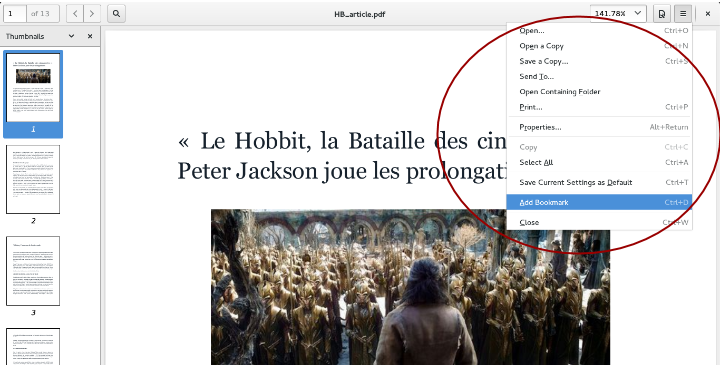
Participants struggled a lot when they had to bookmark a specific page. Most of them missed the “add a bookmark” option from the hamburger menu, as the list of options from this menu starts with words related to file manipulation (save a copy, open a file, etc.). So whenever they opened this menu, they did not want to read all the items of this list. Most of the time, they made comments like “It’s not here, I have to look somewhere else” or “This should be obvious, I would like to know how to do it”. Most of the users who discovered this option and selected “Add a bookmark” from the list, were complaining about the fact that there was no « visual effect », so they were not sure if the page was really saved somewhere.
Also, in the french version of the interface, the “bookmark” word was translated into “signet” (instead of “marque-page”, a more common translation of “bookmark”), which was not explicit enough to help some of the participants understand the meaning of this feature.
- Save file modifications (task 3)
Most of the participants got confused by the “Save a copy” option from the hamburger menu (see image above). They did not seem confident that this option was the right one and most of the time they said that they did not want to save a copy of the file, but only to save the modifications in the current file. Even if they hesitated at the beginning, almost all the testers could solve this task. But they did not seem satisfied with this option, because they had to go through undesired steps, like a dialog box that asked them if they wanted to replace the existing file.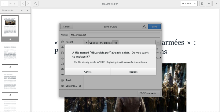
Characters
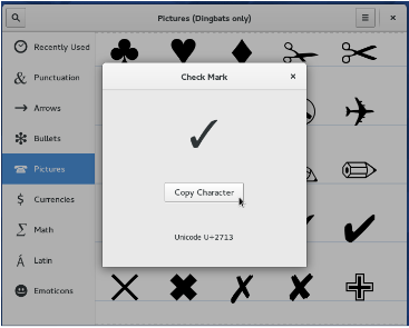
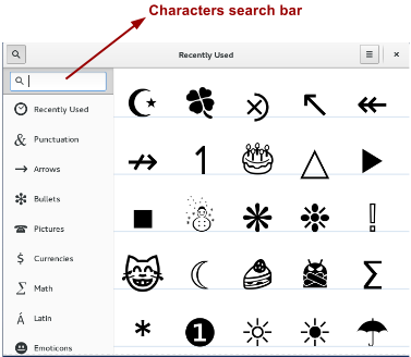
When they had to use the checkmark symbol from the “Dingbats” font in the new Characters application, some of the testers used the magnifying glass in order to search for the name of the font. They got a little confused because the search bar’s purpose was not mentioned anywhere. So after they discovered that the fonts were in the hamburger menu, they found the right symbol by browsing through all the available categories.
Most of the people who had never used GNOME before got lost when they had to copy the checkmark(✓) character. They did not understand what happened when they clicked on “Copy Character” (or if the button really worked). They also complained that there was no visual feedback when clicking on this button:
 But I think this happened because the testers were not used to this type of application, no matter the system they usually use.
Calendar
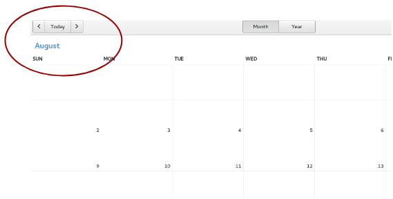
In the Calendar application, changing the month/year of the current view was problematic for some users. In order to change the current month, they had to use the arrows on both sides of the “Today” button (see image below). In general, people expected these buttons to change the current day.
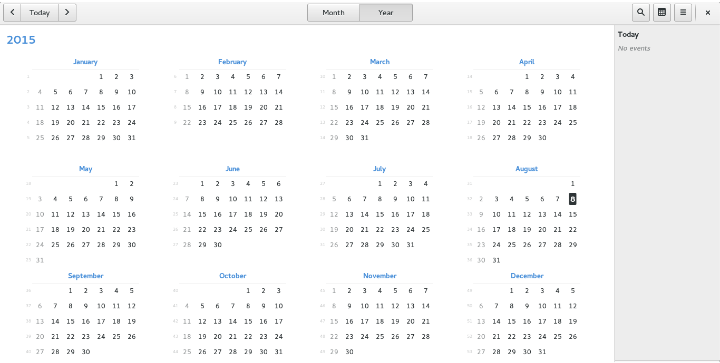
Concerning the year view, users also expected to access a specific month view by clicking on its name:
Also, participants noticed that when they were in the “year view” of the Calendar, the days when they had planned events were not highlighted.
Image Viewer
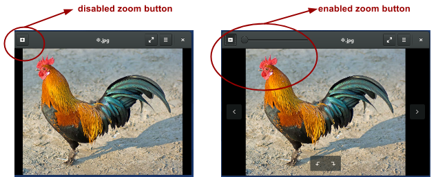
In Image viewer, most of the participants struggled to find the zoom button from the top-left corner, as they had to click on the “+” button (see image below), which allowed them to use a zoom slider:
For some users, I decided to present them the application with the zoom button already enabled. In this case, they encountered no problem noticing from where they can adjust the image. Anyway, most of the testers knew many ways to zoom in and out into an image (CTRL +, using the mouse scroll or the touchpad).
Test overview
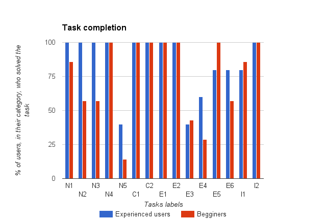
Below I present you a general view of the tasks that were completed (or not) during the test, according to whether testers had already used GNOME before or not. In the histogram below, each task is represented by the initials of the corresponding program (N for Nautilus, C for Calendar, E for Evince, and I for image Viewer), and by the number of the task.
We can see that the difficulty of some tasks (like N5, E3, E4) was independent from the participant’s experience with GNOME.
Note that in this blog post I only presented you a part of the tests results. Stay tuned for the next week, where I will come back with more details of this GNOME usability test!
Interesting test results! Reading through the results, it seems your testers complained most about these issues:
LACK OF OBVIOUSNESS
.. the absence of symbols like + or – in the zoom slider .. why there was a checkbox for the slideshow animation if it cannot be seen checked when the slideshow is launched .. “It’s not here, I have to look somewhere else” or “This should be obvious, I would like to know how to do it.”
LACK OF FEEDBACK
.. there was no “OK” or “Apply” button and they waited for an immediate feedback .. “Why nothing is happening?” or “This is not working.”
It also appears that testers responded well to FAMILIARITY:
.. used the CTRL + F shortcut or just explored the files .. many ways to zoom in and out into an image (CTRL +, using the mouse scroll or the touchpad) .. Calendar task was definitely easy for the participants, as the program responded the way they expected.
I find it interesting that testers were confused about the application menu, and the use of right-click instead. I think more work is needed in the application menu. In my previous usability tests, menus were an important part of usability. In GNOME, some actions are in a “gear” menu, while other “top level” or “global” actions are in the application menu.
In my testing, some testers discovered the functionality by clicking on the “gear” menu. Having found that menu, they didn’t often experiment with the application menu. So any functionality under the application menu may have been rendered invisible.
LikeLiked by 1 person
Isn’t that arguing for a re-examination of the app menu’s utility?
Can that even happen at this point?
LikeLike
I’m reliefed to know that all users were able to complete their Calendar taks. Looking forward more in-depth analisys of the data.
LikeLiked by 1 person
This is excellent work! I assume you have made the maintainers of these applications aware of the results directly? There really should be fixes made based on this research.
LikeLiked by 1 person
Of course. That was the purpose of my internship, to highlight what goes well or wrong with some GNOME applications, through usability testing.
LikeLike
Wow. Finally some *transparent* usability testing! This is what i feel have been missing in many OS-projects to make collaboration truly happen on this level as well. Its a much needed tool so we can come together to find solutions to issues we agree on. Thank you so much for your hard work and insight into it! I hope this is onlythe beginning and I’m looking forward for much more to come hopefully! 🙂
LikeLiked by 1 person