Last week I presented you a detailed description on what went well or not during the usability test I conducted between weeks 8 and 9 of my Outreachy project. This week we will take a closer look on how testers did for each task, which will help us to understand where and why there were most of the problems.
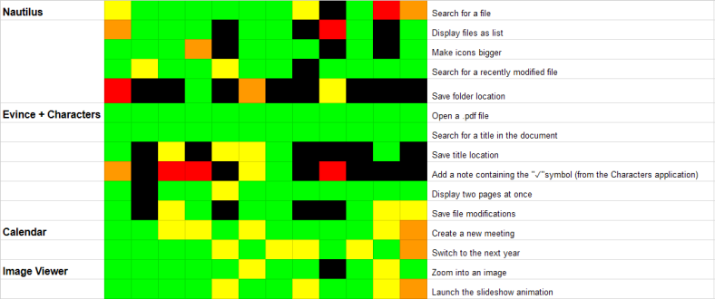
For each program, I used Jim Hall’s heat map method, a grid that indicates how easy or difficult it was for the participants to accomplish a task. Each column of the grid represents a different tester. In this case you will see 12 columns, since I had 12 persons in my usability test.
You may notice that the heatmap contains 5 different colors, so before starting to read each block from the grid, you must understand what each color represents:
- Green , when testers had no problems at all in completing the task
- Yellow, when testers encountered little difficulty in completing the task
- Orange, when testers had a lot of problems in completing the task
- Red, when testers got lost and struggled a lot in completing the task
- Black, when tester was not able to complete the task, and gave up
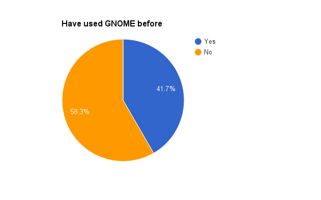
In the analysis below, you may also notice that there is also a pink square around the blocks of the last 5 participants. They are the participants that had never used GNOME before, so I decided to highlight this part of the grid, as they had similar behaviors when accomplishing some of the tasks.
Analyzing the heat map
By “reading” the heat map, we can see that in Nautilus, most of the testers did not manage to accomplish the 5th task (bookmark the location of a folder). One of the GNOME beginners did it by accident (drag and drop) and said that he would never had thought about this method of adding a bookmark. Almost all the users expected the sidebar area to be more explicit, people expressed their desire to see the titles for each category of folders (personal, network, bookmarks, etc) in this area.
In general, participants encountered most of the problems in the “menus” area from the header bar (hamburger menu, magnifying glass), as they were not explicit enough for them. I wanted to highlight this problem, because when they did not know what a button/functionality meant, almost all the participants expected a hint when they put their cursor over it, especially the testers who had never used GNOME before.
As for Evince, almost the participants could easily accomplish the tasks 1, 2 and 5. When they had to search for a file, all experienced users used the magnifying glass, but some of the GNOME beginners preferred to browse the files and folders. After “exercising” the header bar menus from Evince (during previous tasks), participants knew where to search when they had to accomplish the task 5.
However, bookmarks also caused problems in Evince, since half of the users failed to accomplish this task. In Evince, there are two ways to add a bookmark: by using the option from the hamburger menu, or the one in the sidebar pane. Experienced users who used the option from the hamburger menu also discovered the one in the sidebar panel. These testers complained about the lack of “consistency” between these two methods, as they do not function the same way. For example, a bookmark cannot be deleted from the hamburger menu, whereas it can be deleted from the side pane.
From the heat map, we can see that almost all the GNOME beginners failed to add an annotation to a PDF document, and almost every experienced user encountered difficulties to accomplish this task. It is obvious that some improvements must be done for this feature, since most of the testers found it useful.
More than half of the testers could save the modifications of the PDF document, but most of them were confused when they used the “Save a copy” option from the hamburger menu.
Participants quickly became familiar with Calendar’s interface, so they all managed to accomplish the two tasks. Though, users who encountered little difficulty during these tasks were a little bothered by some aspects of the interface like described in my last post.
Testers also had an easy time during the Image Viewer tasks, and encountered little difficulty accomplishing them. Unlike experienced users, GNOME beginners discovered another way to zoom into an image, by entering into the full screen mode, and using the “+” and “-” top buttons in order to adjust an image.
About the participants
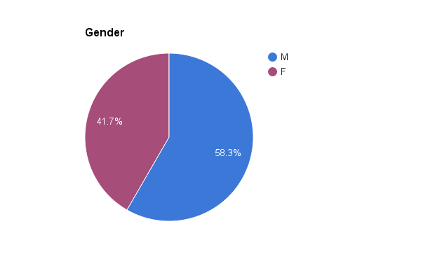
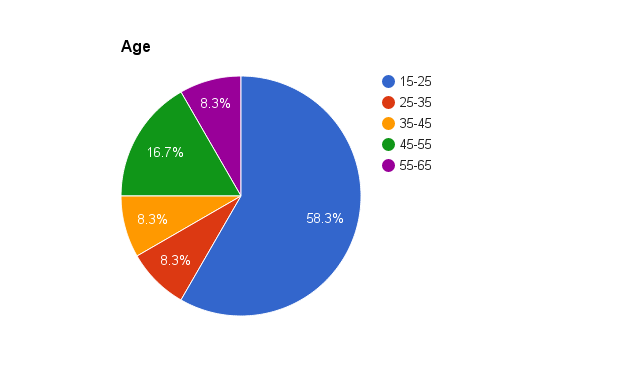
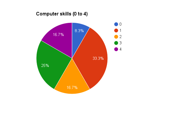
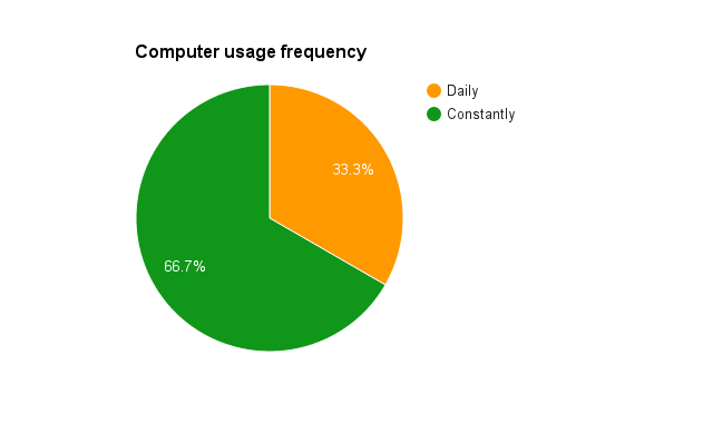
In order to have a better overview of participants of this usability test, I wanted to share with you the following diagrams:
This post ends the test results description, but does not end the discussion on this GNOME usability test. From now on I am open to all your suggestions/questions related on the subject.
PS: Follow up my “special” blog post next week, see you soon! 🙂


So cool to see these results, and that usability testing is being done! I am curious, how many people took part in testing? and were all of these on-site or were some of them performed online?
LikeLiked by 1 person
Thank you! There were 12 people participating in this usability testing! And the tests were performed on-site!
LikeLike
Great work!
Do you have a list of bug reports that have been opened for these issues or a link to a mailing list where gnome developers are discussing how to fix these issues you’ve found?
LikeLike